This is the follow-up to From Free Wix Subdomain to Professional .co.nz, the 2026 project that moved the business off a free Wix site.
The challenge
The first build did its job. The business had a .co.nz domain customers could remember, local SEO across Hamilton, Cambridge and Morrinsville, its 57 Google reviews on show, and an enquiry form that sends a formatted email to the owner.
Shortly before this project, the site had been redesigned into a calm, neutral look: stone and sage backgrounds, forest-green buttons and clean type. It was tidy, but it could have been any trades business anywhere. The brief asked for:
- Something that felt like New Zealand, without leaning on ferns or kiwi birds.
- Something that felt like mowing. The logo was a stock-looking mower icon, and the site used a generic icon set.
- Dandelions. The weed every lawn has, and the seed head every Kiwi kid has blown on.
- Freedom on type and colour. Nothing was off the table.
There were limits too: pickup and drop-off is _included_ in the price, never "free", and the owner prefers not to appear on the site.
The approach
As with every project, decisions were made on working mockups rather than mood boards: real copy, real prices, the business's own repair photos, and phone screens you could scroll and tap.
Round 1: three directions
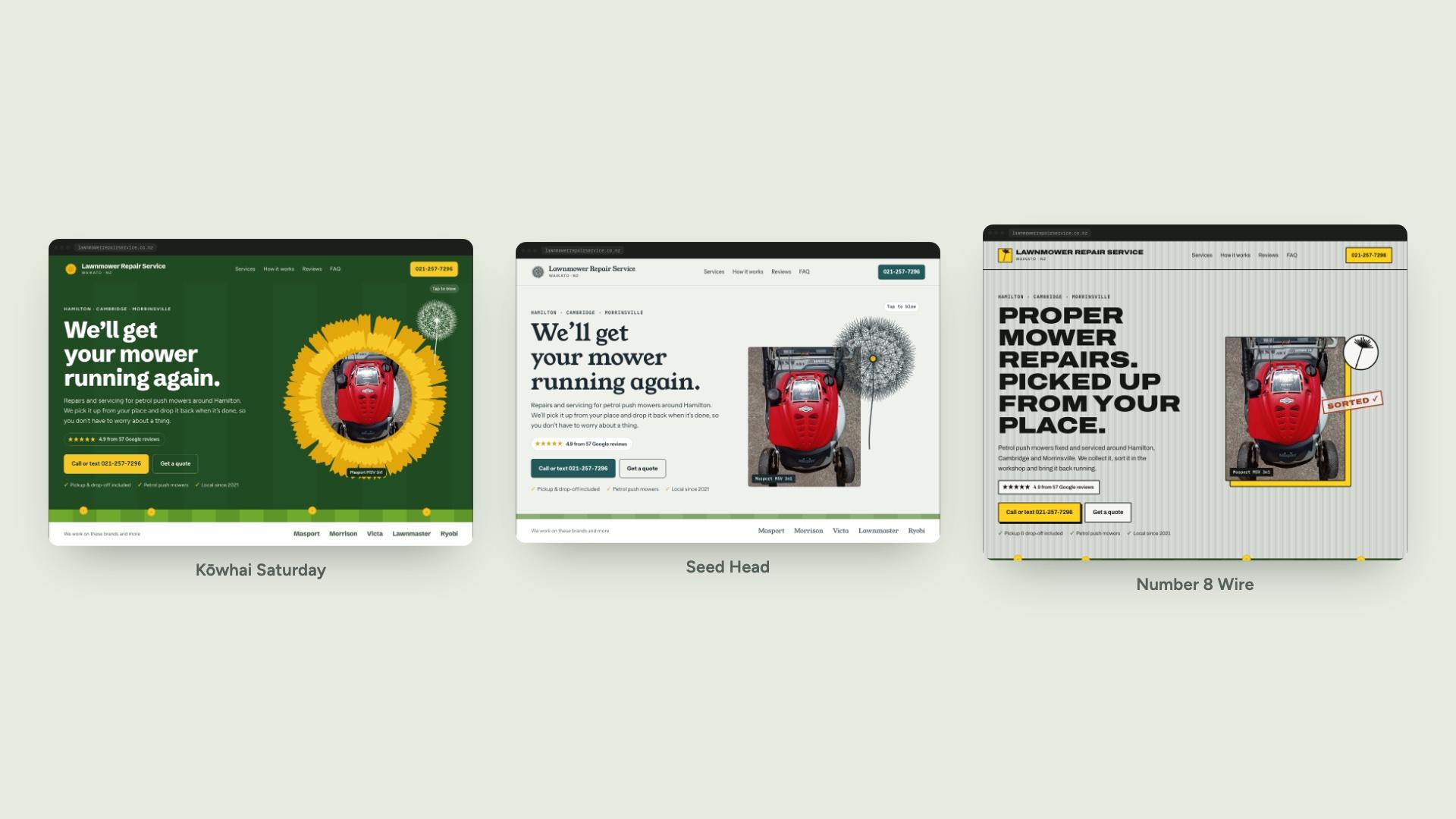
- Kōwhai Saturday: sunny Kiwiana. Dandelion yellow on paddock green with mown lawn stripes, and the mower photo set in the middle of a dandelion.
- Seed Head: calm and airy, in morning fog, ink and Waikato River teal, with a fine-line dandelion clock you could tap to blow away.
- Number 8 Wire: the back shed. Galvanised iron, hi-vis yellow, a "Sorted" rubber stamp and extra-wide capitals.
Each direction also came with a fridge magnet and a workshop swing tag, because for a local trade that's where customers meet the brand.
The dandelions were generated in code rather than drawn by hand. The seed head is around a hundred seeds placed on a sphere, each with its own fan of filaments, and the flowers are rings of toothed petals. Because the shapes come from a fixed seed, the same drawings can be reused anywhere: on the site, in the favicon, and in print.
Kōwhai Saturday was chosen.
Round 2: the whole site, then a step back
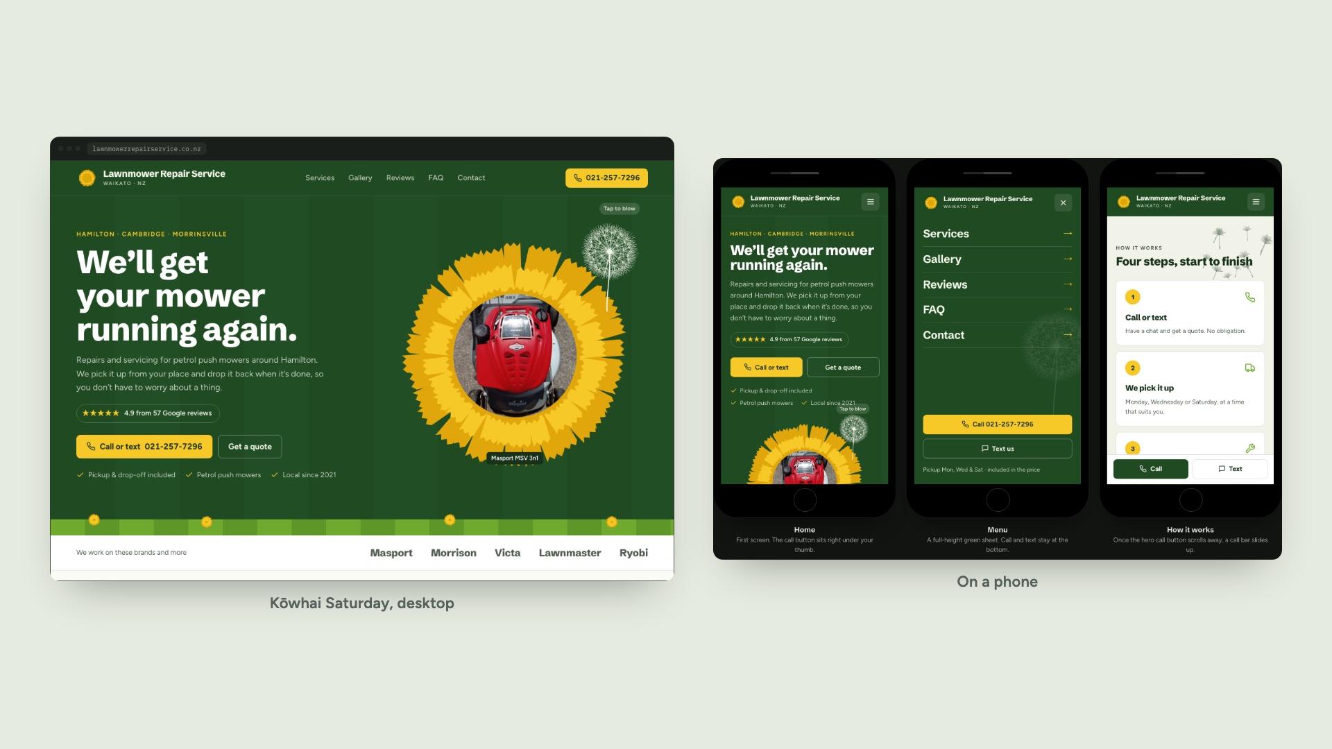
The first feedback was that the retro headline face felt cartoony, so it became Schibsted Grotesk, a sturdy newspaper grotesk. Then Kōwhai Saturday was built out into a full homepage you could scroll, plus working phone screens at iPhone SE size.
Seeing it everywhere is what changed the decision. On a single hero the dark green and lawn stripes felt fun. On every section, on a small screen, they were too much for a small local repair business. The decision was to go back to the calm look the site already had, and bring across only the new type and the dandelions.
That became the brief: keep the palette customers already trusted, and put the personality in the details.
The direction: Calm Workshop, with a mower and dandelions
- Colour: unchanged. Stone #F4F6F1 background, sage #E6EBE0 bands, forest #2F5B1D buttons and leaf #6FAA2E for grass. Dandelion yellow #F6C928 was added, but only for illustrations, never text or buttons.
- Type: Schibsted Grotesk at extra bold for headings, Figtree for everything else.
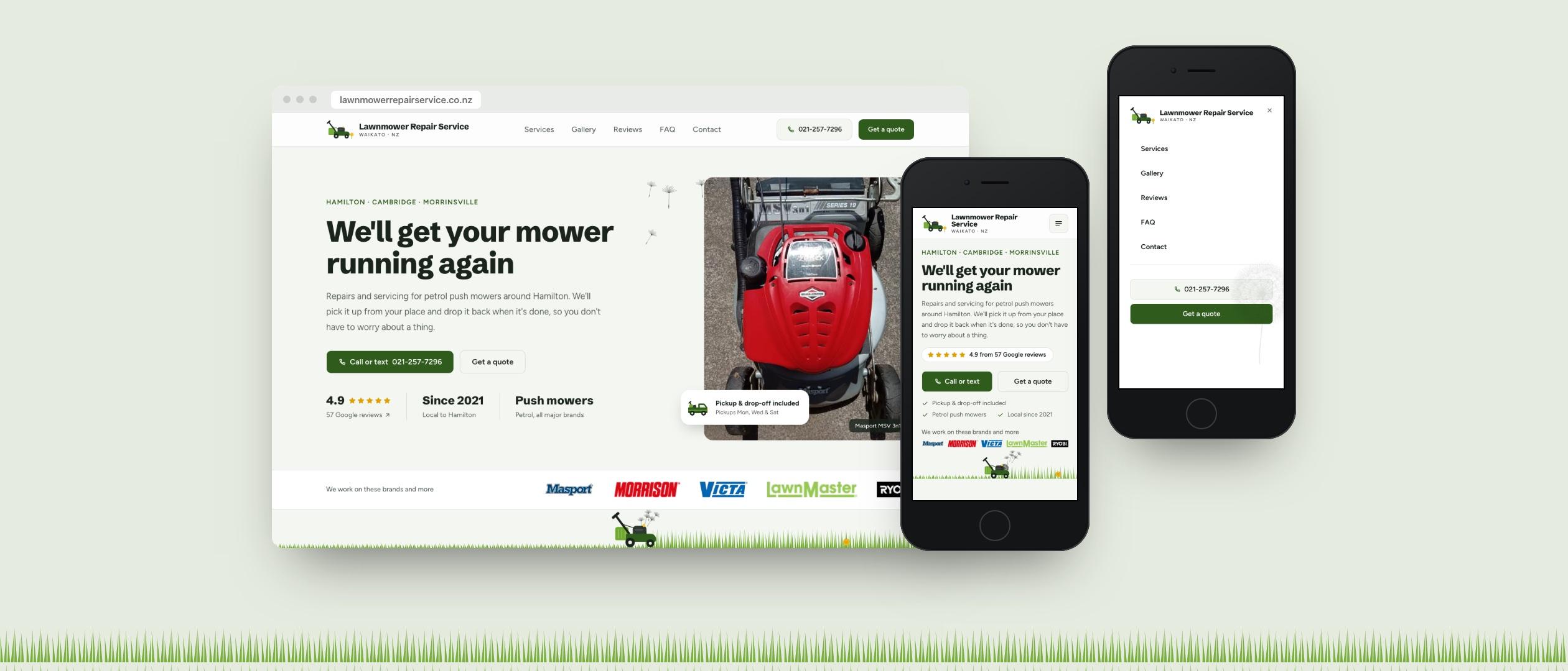
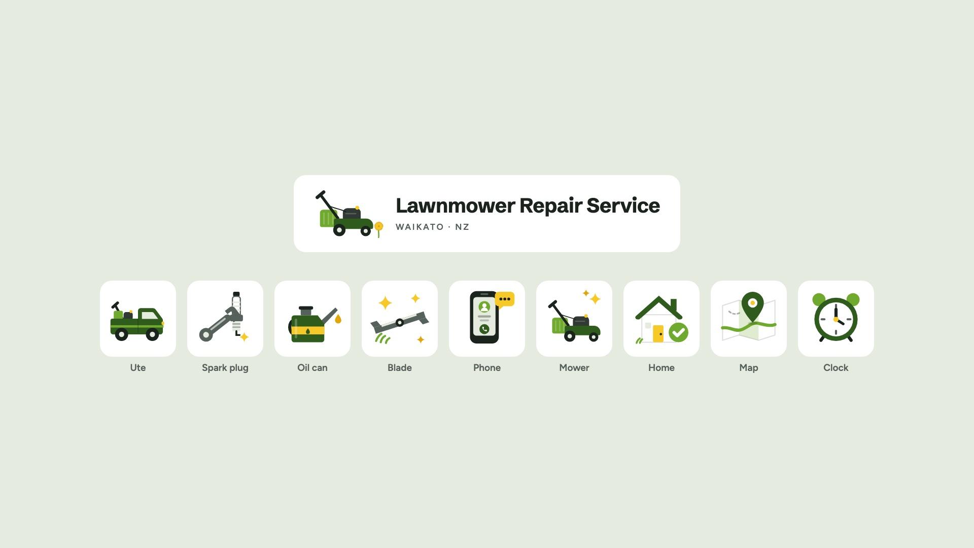
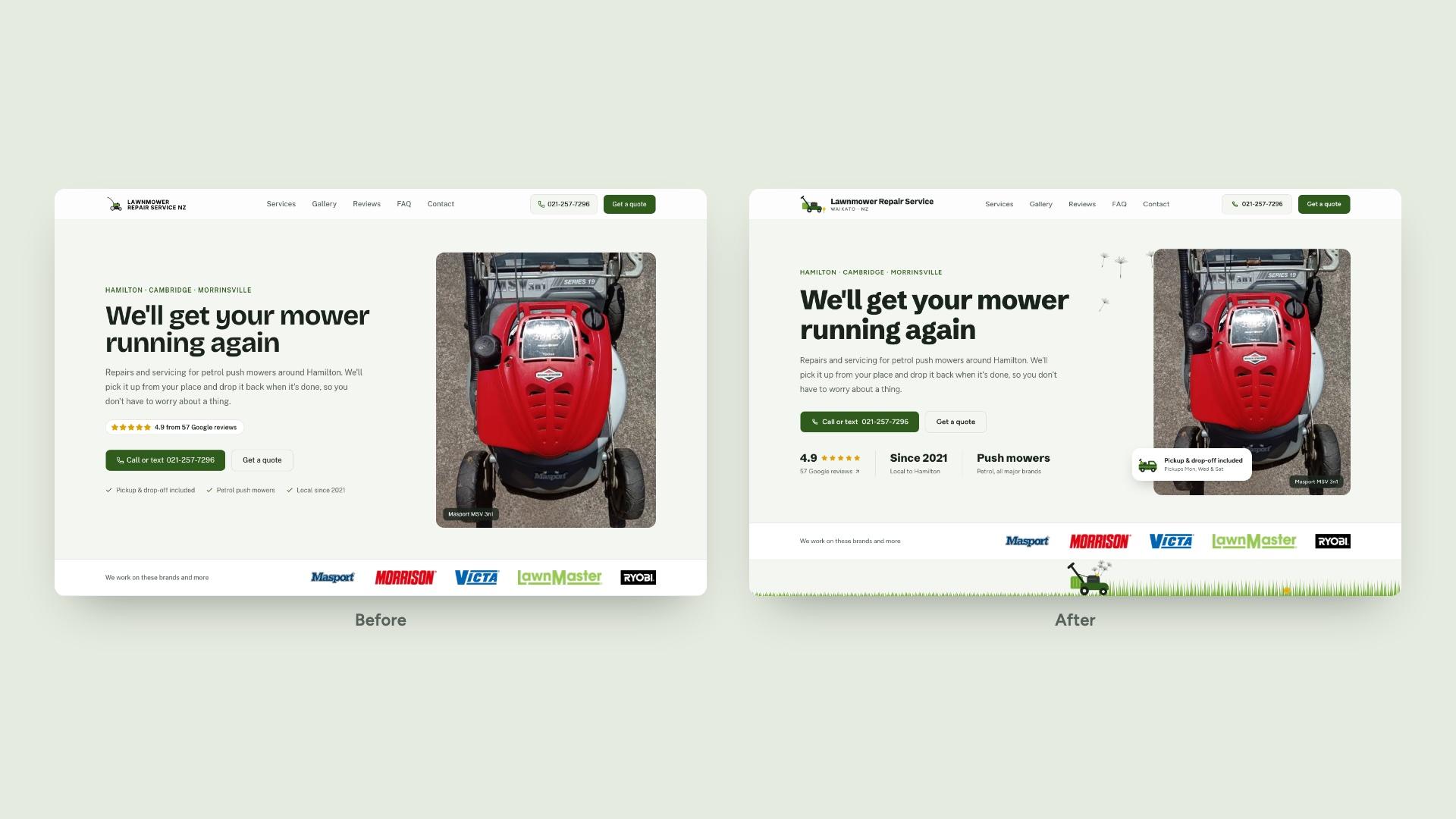
- Logo: a lawnmower drawn in flat colour, with a grass catcher and a yellow fuel cap, and one small dandelion in its path. The favicon drops the flower so it still reads at 16px.
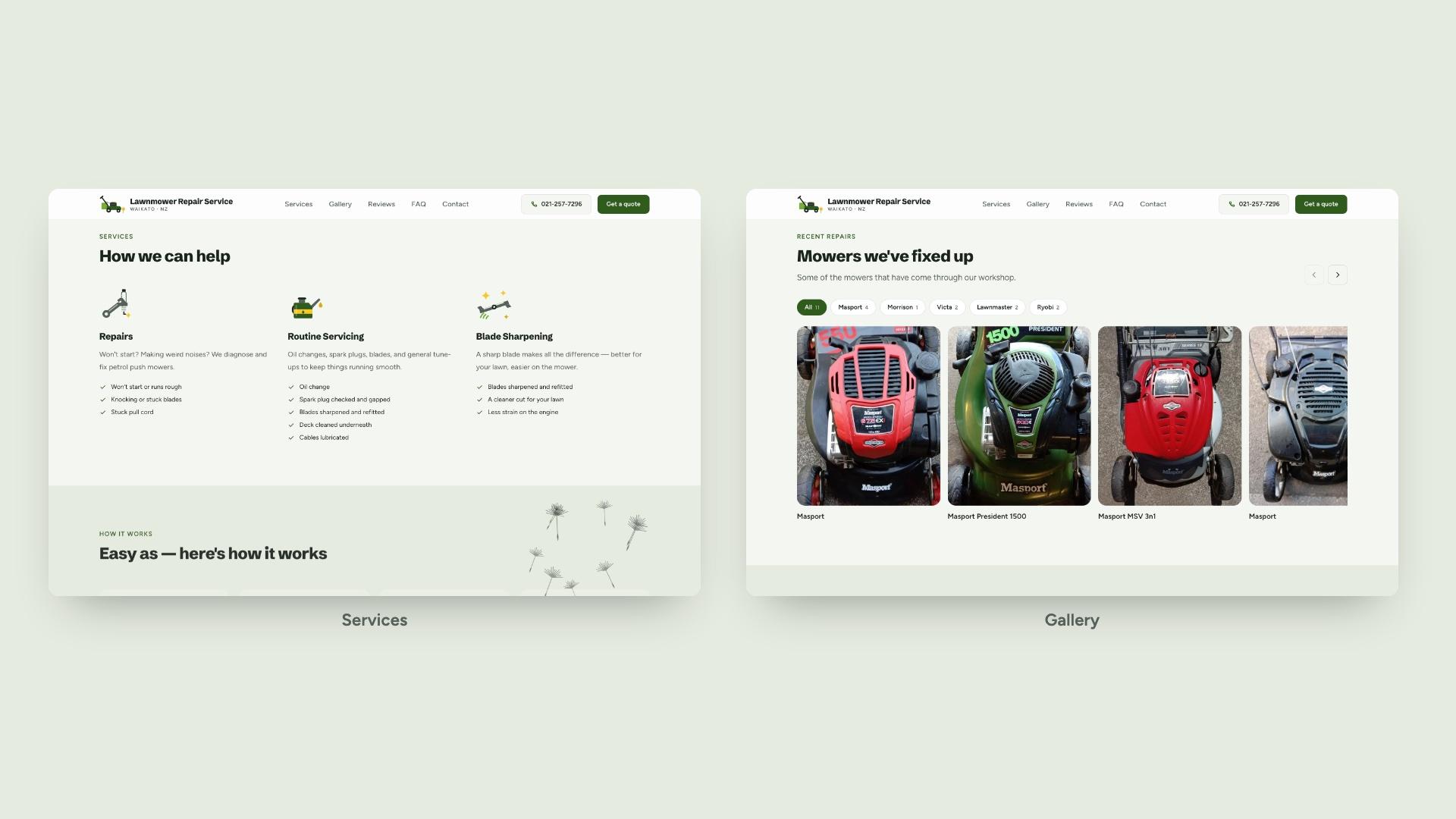
- Illustrations: nine full-colour spot illustrations in the same flat style as the mower, shown large.
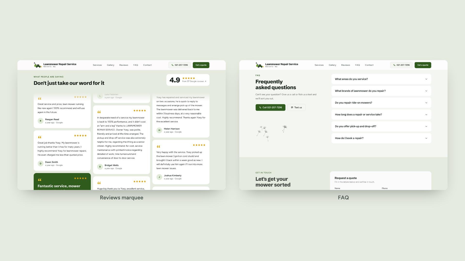
- Dandelions, in small doses: a few seeds drifting past the hero photo, through How it works and the FAQ, and a faint seed head in the mobile menu.
- Buttons: one height scale (36, 44 and 48px), with 44px as the minimum tap target.
The rebuild
The rebrand landed in 29 small commits on the existing Next.js site, each reviewed on screen before the next.
- Foundations. New type, the dandelion colour tokens and the button scale.
- Logo and icons. The new mower logo, regenerated favicons and app icons. Every icon from the generic library was replaced: content icons became the full-colour illustrations, and interface icons became a matching single-colour set.
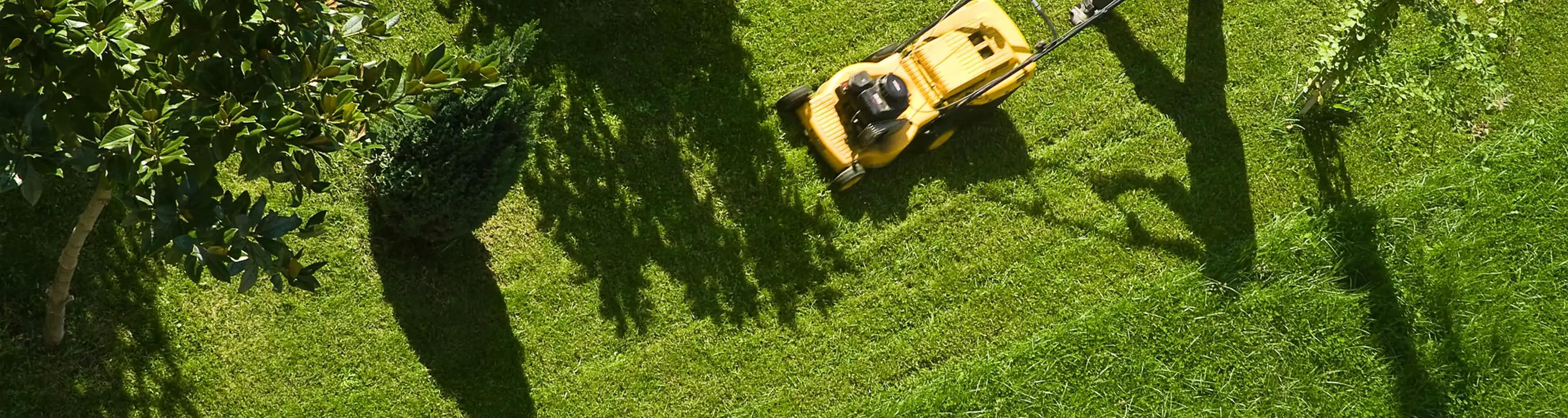
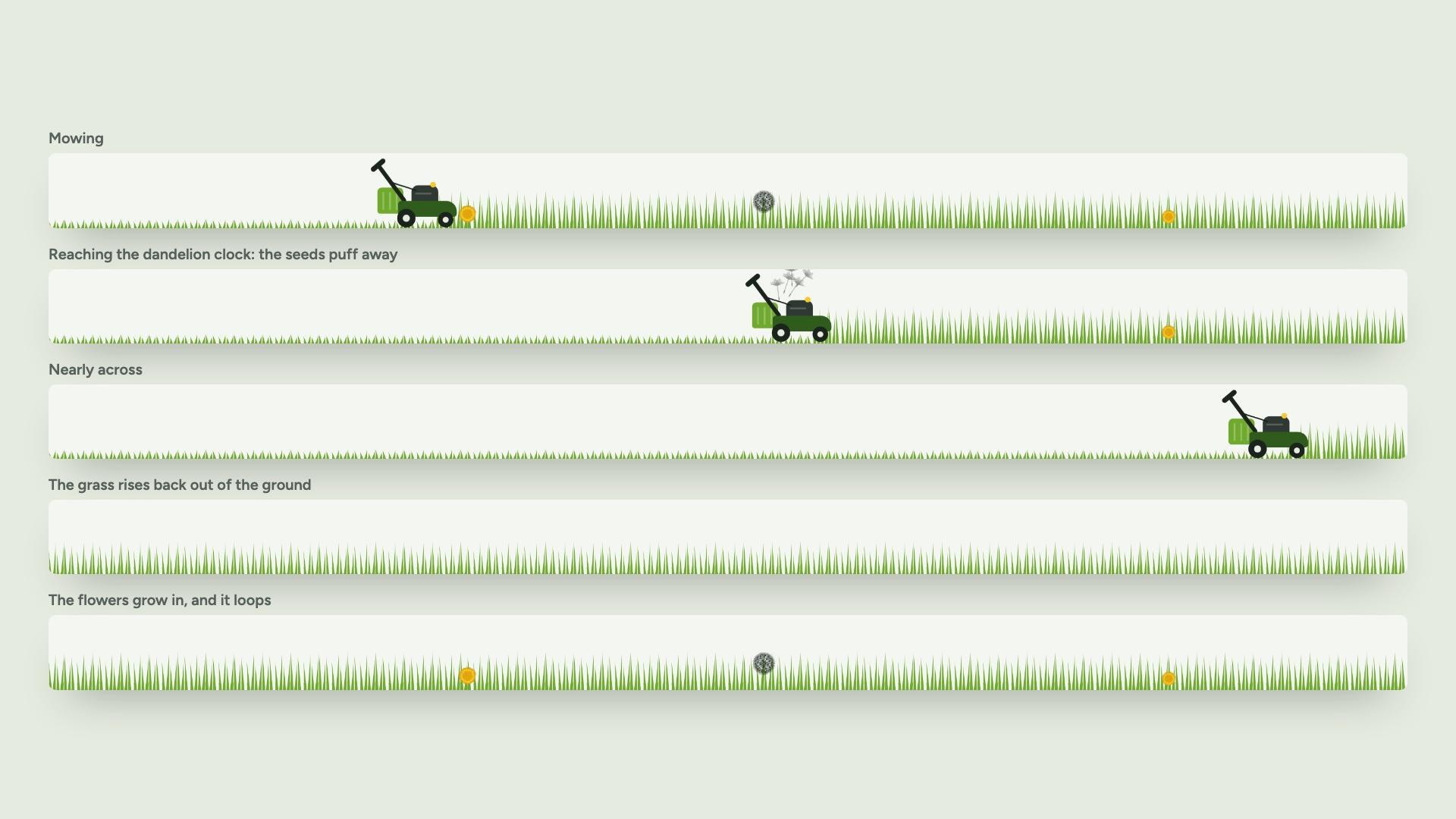
- The mowing strip. A mower drives across a strip of grass right under the brand logos, cutting as it goes. When it reaches a dandelion clock the seeds puff away. Then the grass rises back and the flowers grow in, and it loops. It sits above the fold on desktop and on a phone, and it stands still for anyone who has reduced motion turned on.
- Hero. A pickup-and-drop-off card pinned to the photo, and a stats row: 4.9 stars from 57 Google reviews, local since 2021, and petrol push mowers of all major brands. On phones the photo is dropped so the logos and mowing strip still fit on the first screen.
- Sections. The gallery became a swipeable row with brand filters. Reviews became slow-drifting columns that pause on hover. The FAQ got a call and text prompt that stays in view. The quote form now stays in view while you read the hours.
- Mobile. The menu now fills the screen on phones, instead of a side panel with the page showing through.

Technical implementation
- Generated art. The dandelion geometry is generated from a fixed seed, so the server and the browser draw identical shapes and nothing jumps when the page hydrates.
- Illustrations as components. The illustrations and the mower are SVG React components that take their colours from the theme tokens, so a palette change updates every drawing.
- The mowing animation is CSS only, driven by one registered custom property,
@property --mow. The mower's position, the cut line and each flower's trigger point are all calculated from it, so they stay in sync at any screen width. Regrowth moves and scales the grass and flowers rather than stretching them, so the round flower heads never squash. - Checked from real builds. Every change was checked with headless Chrome against a real production build, on desktop and at 375 × 667. Animations were frozen at set frames, to confirm the strip stays above the fold and the regrowth reads correctly.
- Environment-aware URLs. The site's absolute URLs (canonical, Open Graph and structured data) now resolve per environment: the live domain in production, the deploy URL on previews, and localhost in development. That means link previews can be checked before anything is live.
The share image
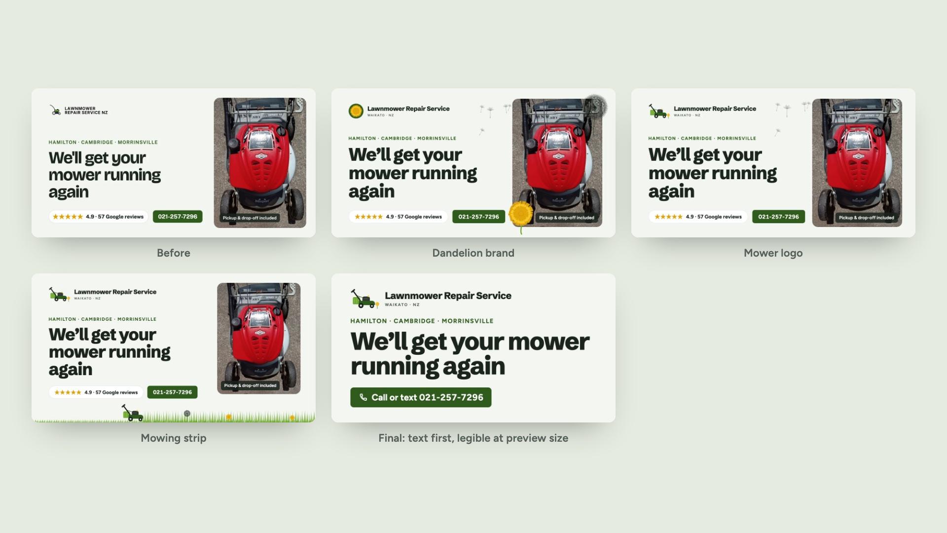
The share image went through six versions. The early ones had the repair photo, ratings and illustrations. The final one is text only: the logo, the towns, a big two-line headline and a call or text button.
The reasoning: most people will only ever see this image as a link preview in Messenger, iMessage or a Facebook group, at about 40% of its size. At that size the headline and phone number are what count. It was checked at 480px wide, and it's served as a JPEG at a fixed address so every preview shows it.
The impact
The site now looks like the business behind it: a local repairer who picks up your mower, fixes it properly and brings it back. The calm palette customers already trusted is still there. What's new is in the details: a mower logo that's easy to recognise, illustrations that show the actual job, and a little mower crossing the lawn on the first screen.
All of the brand lives in code and in the repository: the colours, type, logo, illustrations, animation timing and share image, plus an offline copy of the brand board. The next change won't start from scratch.
The rebrand went live on [date]. Results are still to be measured.
 Next.js